Page 12 - Issues131-133
P. 12
Then, they inspired its presentation by Greek mythology. To do something distinctive
               and "fight" in this category that is increasingly popular with artisan producers. They
               tried to follow a thread between the name, the image on the label representing the
               Achilles’ fury, and the cap with its distinctive helmet.

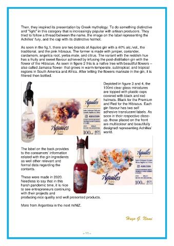
               As seen in the fig.1, there are two brands of Aquiles gin with a 40% alc./vol., the
               traditional, and the pink hibiscus. The former is made with juniper, coriander,
               cardamom, angelica root, yerba mate, and citrus. The variant with the reddish hue
               has a fruity and sweet flavour achieved by infusing the post-distillation gin with the
               flower of the Hibiscus. As seen in figure 2 this is a native tree with beautiful flowers –
               also called Jamaica flower- that grows in warm-temperate, subtropical, and tropical
               regions in South America and Africa. After letting the flowers marinate in the gin, it is
               filtered then bottled.

                                                                        Depicted in figure 3 and 4, the
                                                                        100ml clear glass miniatures
                                                                        are topped with plastic caps
                                                                        covered with black and red
                                                                        helmets. Black for the Premium
                                                                        and Red for the Hibiscus. Each
                                                                        gin flavour has two self
                                                                        adhesive translucent labels. As
                                                                        seen in their respective close-
                                                                        up, those placed on the front
                                                                        are multicolour and beautifully
                                                                        designed representing Achilles’
                                                                        world.


               The label on the back provides
               to the consumers’ information
               related with the gin ingredients
               as well other relevant and
               formal data regarding the
               contents.

               These were made in 2020.
               Needless to say that in this
               harsh pandemic time, it is nice
               to see entrepreneurs continuing
               with their projects and
               producing nice quality and well presented products.

               More from Argentina in the next miNiZ.


                                                                                       Hugo G. Nami


                                                          - 11 -
                                                          = 11 =
                                                          = 11 =

